Sunday 5 April 2015

Final Products

Morrighan Humpleby
Candidate Number: 9454
Brief 1: Main product: Music Video. Two ancillary products: Digipak and Website Homepage

Man Artifact- Final Music Video:

Morrighan Final version with website link from morrighan humpleby on Vimeo.

Ancillary Product 1- Final Website Homepage:
http://morrighanh.wix.com/blacksyndicate 


Ancillary Product 2- Final Digipak:


Final Evaluation Website:
http://morrighanh.wix.com/evaluation

Sunday 29 March 2015

Final Digipak

I have now created my final Digipak for the band as one of my ancillary products. The following four pictures are pictures of exactly what I printed, all to scale. 


The following pictures depict what I did to create the CD case and its linear notes.
I folded the individual sheets for the linear notes along the spine, layed then in the correct place, to construct the right order. I then used spray mount to glue them together. I glued two halves together and then glued the front and back cover sheet onto the remaining two empty faces of the linear notes, to create the finished version. I then used a linear rotary cutter to cut off the excess paper. 

To create the final digipak, I followed a similar process, I backed both images onto a single piece of card, one picture on one side, the other on the opposing side. (I did not use card when sticking the linear notes, as it needed to be a booklet and not as thick and ridged as the Digipak.) Once the pictures were back on the card, I simply folded the edges and glued it together to create this final digipak.


To resolve the issue of the visable tabs, I was unable to find a perfect solution, but what I did worked to a much better standard than the previous version of my digipak. I cut the tabs a lot smaller, and glued them to one side of the sleeve so they were more hidden and discreet. 


Saturday 28 March 2015

Adding Black Syndi-Conga To The Video

On the digipak and website there is the slogan, join the black syndi-conga, but it wasn't on the music video. I wanted it to become a thing associated with the band, a memorable saying for the band. However I realised it wasn't on the music video, and it didn't work continuity wise. It made no sense for it to be on both the digipak and website but not the music video.

It was important to me that I keep the fonts consistant, so I needed to learn how to import a font into Final Cut Pro. Following a YouTube video I found online I learnt how to import the fonts.


Not only did I keep the font the same, I also wanted the colour of the font to be the same, so made it the same dark red. I wanted the focus to be on the slogan, so I then inserted the website below, but smaller, so you can read it but its not the focus. I just added it at the end of the video after the production company, as an extra advertisement.

Thursday 19 March 2015

Second Digipak Draft


I have recently created a second digipak drafted. I created a Emaze explaining the changes from the first version to this one.

Powered by emaze

Fonts


I had to consider the fonts for my website and Digipak very carefully. I wanted the font to follow the style of music, hard, grundgy, and rock feel to it. But I needed to be legible to read. I needed a font for the website titles, body text, and then font for the song titles and lyrics in the linear notes and finally a font for the track list. But I also wanted the products to have a link between them and work continuity wise, so wanted to use two or three fonts across the products.

Knife Fight was a font that really took my eye from the start of researching fonts. It looked ideal for a title

Wednesday 18 March 2015

Website Issues


I am having a few issues with my website that I can't seem to fix. The left image is of the website while I am in the editor mode and making changes. You can see that all the words lines up and fit the boxes they are backed on. However when I publish the website and view it as if I was a fan entering the site, this is what it looks like(the right hand picture). You can see that the font doesn't fit the boxes and has all moved about. I have tried multiple things to fix this issue, resizing the font, resizing the boxes, changing the font, but nothing seems to work.

Thursday 26 February 2015

Album Cover Requirements

http://www.entertainerlaw.com/pdf/albumnotes_101.pdf


When considering the product of my digipak I thought back to GCSE graphics where I produced my own cd case. Looking back at it, it looked very basic in terms of what was included on the front and back of the cd. This was due to how little there was. It just didn't include all the things you see on a normal cd case. So this was something I knew I needed to look into to create an effective and aesthetically pleasing, realistic digipak.  I did some research online into the conventional things included on a CD case. I came across a PDF document with a long list of all the things you must/should include and how to write and place them. This PDF proved to be very helpful. So I converted the document into a Powepoint for ease of use and followed that when creating the information on my digipak. 

Website Development

When I inserted the picture into the website, although I thought I had saved it as a transparent picture with no background, it still saved in a white box, so I needed to fix it. So I did some research online to try and find out how to save it transparent. 

http://www.webdesign.org/photoshop/photoshop-basics/saving-a-file-with-transparent-background.6877.html

Following the simple instructions that I found online, I saved the image and uploaded it to my website.  However this time it was in a blue boxed background.
Upon investigating the issue I came across the 'Change Style' box for the photograph, it was selected on no frame but I also tried the 'Default' box and this removed the blue box and created the transparent background. 


CD case mock up


I have recently made
my small mock up of
the CD case I intend
to make.

I was originally making the digipack net I had found online, but while making it I realised that it wasn't the shape that I wanted so I kind of bodged it and made it how I thought it would be made. It did eventually create the shape I was hoping for.


 Below is the net that I created by cutting extra tabs off the net allowing me to create pockets where I wanted them. I then cut the center spine part of the CD case off and stuck it down, creating two flaps to the side


Saturday 21 February 2015

Initial Final Version

Following my colour correction edits on my product, I have recently finished what I see as my first final version of the footage. I have posted a link to my Instagram and added a link on my Facebook asking them to watch the film and fill in my questionnaire of feedback incase there were things about the production they didn't like or felt that needed to be improved.

My initial final version;

morrighan media first final rough cut from morrighan humpleby on Vimeo.


https://www.surveymonkey.com/s/7HK578P

Friday 20 February 2015

Reviews of Zombie discovery scene

During my feedback session, they agreed that the scene where the band stopped playing to listen to the noise outside and investigate was a little awkward and clumsy. The felt like one of the reasons they felt this was because the music completely stopped for the whole scene until the drummer and base player open the door, which is very unconventional for a music video. I agreed that maybe the stop of music for the whole of the scene is unnecessary but it did need to stop at least once as the band stop playing to hear the noise. So what I did was stop the music but only for a few seconds, and ease it back in once the drummer and base player leave to see to the noise. 

Upon further consideration I thought one issue might also be that its just a static shot through the whole scene. In retrospect, it would be ideal if another camera angle of this scene, however turns out this was the only shot I had of the scene, so had to work with what I had.first three changes


As I said, original the shot was static with no change of angle or anything.
second/final change


So what I did was as the music stopped, cropped the image closer to the band, then do  jump cut further back to show a long stop of the band. In all honesty, I am not happy with the outcome of this section, but this is the best I can do at the moment, and will look into other ways of improving it.


Music in Sync

Sam Shepard, the lead singer of the band is in my media studies class, so I used him to double check the sync of my video. He expressed in the feedback session that some of the drums and riffs are out of time, so needed to fix them. I did to the best of my ability but got him to check it for me, seeing as he plays in the band.

He only pointed out two sections, one the close up on him playing it was a riff behind and on the solo of Sam Betts when they play as Zombies, it is a riff ahead.

Wednesday 18 February 2015

Studio/Production/Distribution Logo- Conventional?


Throughout the time of editing my production I have been toying between whether to put these logos into the video, I was just unsure as to whether this was conventional or not. So I decided to do some research into whether is was conventional or not.Using Vimeo as my platform I search a vary of songs, but focused mainly on the music videos in a similar convention to my own client. I searched lots of videos for lots of artists and only came across a few who mentioned any legalities or companies. Two being Biffy Clyro and Slipknot. And even then it wasn't an image just a company name and who the rights are reserved too, 


So for my own work I decided to add a fade out to a black screen with just a line that says 'all rights reserved by Phantascope Studios'. I felt like it was important for the copy right symbol to before the All rights reserved as this is convention and I believe legality if all rights reserved is stated.  To the left is a web page discussion I found on how to insert a copy right symbol into final cut. And below is me inserting the symbol. 


As I said I decided to add a fade into the end of the product, but to make it more interesting, I made the text appear in the last few seconds of the video and it stays on screen as the music video fades to black it stays on the screen. I feel like this made the production look more professional and ends it nicely.

Following my research, I have come to the conclusion that there is sometimes the Studio logo, but not the other logos as these aren't particularly conventional.

Monday 16 February 2015

Issues With The Footage

 When editing the footage I noticed that the footage from a certain camera was very lined and low quality. I first assumed I would have to disregard the footage on this camera so didn't use the clips, however upon upload to Vimeo, I noticed that clip wasn't lined like it was when editing, so assumed it was an issue just with the footage streamed through Final Cut Pro. I also noticed to clip on Vimeo wasn't in HD so selected the HD button and instantly it was back to the lined footage, so when it was played in HD it was lined, if it was no HD it was much better quality, as seen below.
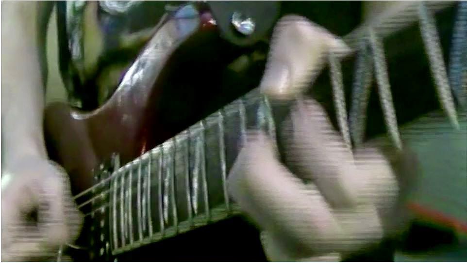
Although hard to see in the picture, this is the footage in HD with the lines.

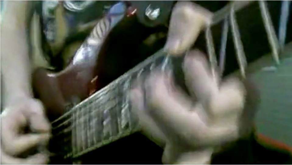
This is the footage not in HD so much smoother overall. 
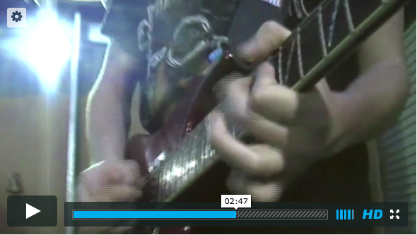
Vimeo 
Final Cut Pro


The difference in quality is easier to see here, you can see just how lined the footage is in the picture directly from Final Cut Pro. Overall there is a slight improvement on quality from HD upload from Final Cut to Vimeo either way, but its only when the footage is played in Vimeo, not in HD that the footage is in the best quality.


I considered the cause of this and decided what probably happened, was the camera with this issue might have been filmed not in HD so when trying to play it in HD it isn't compatible with a HD stream, so when played not in HD do you see the accurate representation of the camera quality.