Sunday 29 March 2015

Final Digipak

I have now created my final Digipak for the band as one of my ancillary products. The following four pictures are pictures of exactly what I printed, all to scale. 


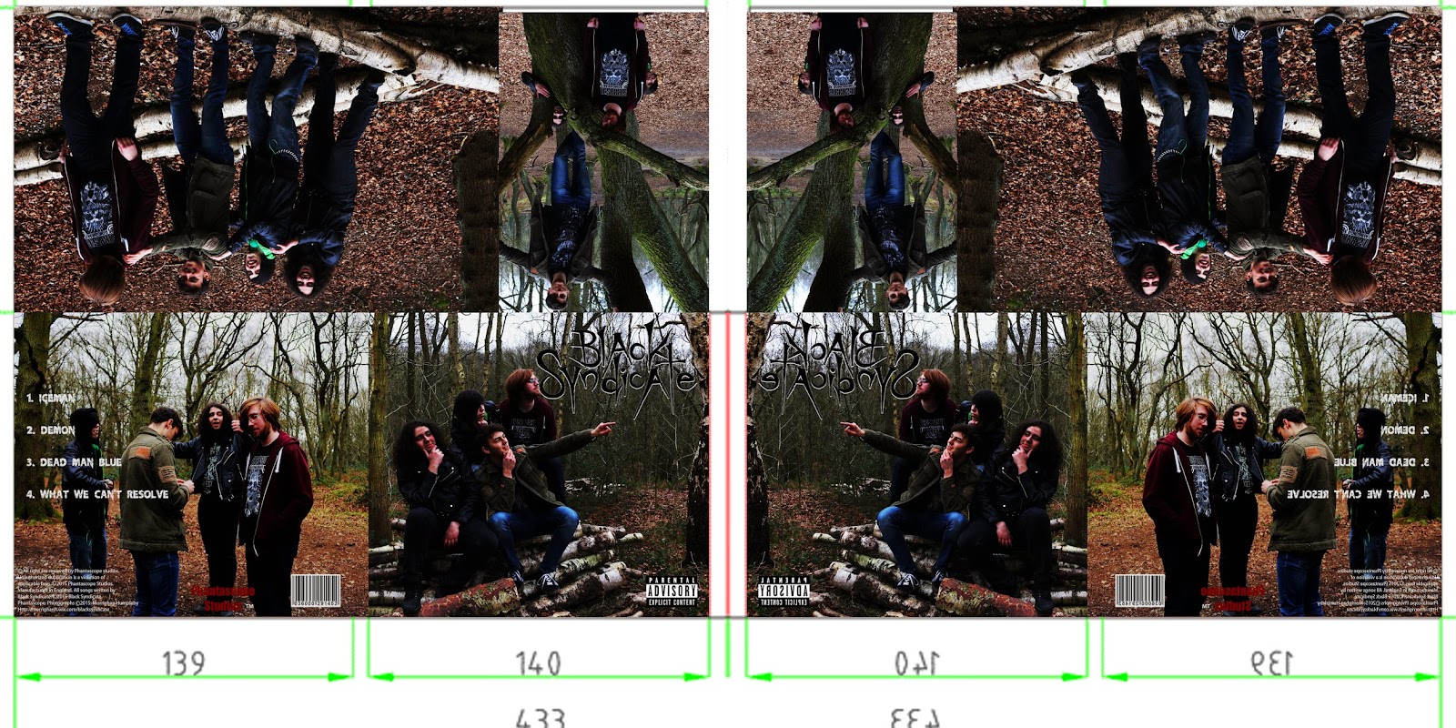
The following pictures depict what I did to create the CD case and its linear notes.
I folded the individual sheets for the linear notes along the spine, layed then in the correct place, to construct the right order. I then used spray mount to glue them together. I glued two halves together and then glued the front and back cover sheet onto the remaining two empty faces of the linear notes, to create the finished version. I then used a linear rotary cutter to cut off the excess paper. 

To create the final digipak, I followed a similar process, I backed both images onto a single piece of card, one picture on one side, the other on the opposing side. (I did not use card when sticking the linear notes, as it needed to be a booklet and not as thick and ridged as the Digipak.) Once the pictures were back on the card, I simply folded the edges and glued it together to create this final digipak.


To resolve the issue of the visable tabs, I was unable to find a perfect solution, but what I did worked to a much better standard than the previous version of my digipak. I cut the tabs a lot smaller, and glued them to one side of the sleeve so they were more hidden and discreet. 


Saturday 28 March 2015

Adding Black Syndi-Conga To The Video

On the digipak and website there is the slogan, join the black syndi-conga, but it wasn't on the music video. I wanted it to become a thing associated with the band, a memorable saying for the band. However I realised it wasn't on the music video, and it didn't work continuity wise. It made no sense for it to be on both the digipak and website but not the music video.

It was important to me that I keep the fonts consistant, so I needed to learn how to import a font into Final Cut Pro. Following a YouTube video I found online I learnt how to import the fonts.


Not only did I keep the font the same, I also wanted the colour of the font to be the same, so made it the same dark red. I wanted the focus to be on the slogan, so I then inserted the website below, but smaller, so you can read it but its not the focus. I just added it at the end of the video after the production company, as an extra advertisement.

Thursday 19 March 2015

Second Digipak Draft


I have recently created a second digipak drafted. I created a Emaze explaining the changes from the first version to this one.

Powered by emaze

Fonts


I had to consider the fonts for my website and Digipak very carefully. I wanted the font to follow the style of music, hard, grundgy, and rock feel to it. But I needed to be legible to read. I needed a font for the website titles, body text, and then font for the song titles and lyrics in the linear notes and finally a font for the track list. But I also wanted the products to have a link between them and work continuity wise, so wanted to use two or three fonts across the products.

Knife Fight was a font that really took my eye from the start of researching fonts. It looked ideal for a title

Wednesday 18 March 2015

Website Issues


I am having a few issues with my website that I can't seem to fix. The left image is of the website while I am in the editor mode and making changes. You can see that all the words lines up and fit the boxes they are backed on. However when I publish the website and view it as if I was a fan entering the site, this is what it looks like(the right hand picture). You can see that the font doesn't fit the boxes and has all moved about. I have tried multiple things to fix this issue, resizing the font, resizing the boxes, changing the font, but nothing seems to work.