When considering the product of my digipak I thought back to GCSE graphics where I produced my own cd case. Looking back at it, it looked very basic in terms of what was included on the front and back of the cd. This was due to how little there was. It just didn't include all the things you see on a normal cd case. So this was something I knew I needed to look into to create an effective and aesthetically pleasing, realistic digipak. I did some research online into the conventional things included on a CD case. I came across a PDF document with a long list of all the things you must/should include and how to write and place them. This PDF proved to be very helpful. So I converted the document into a Powepoint for ease of use and followed that when creating the information on my digipak.
Thursday, 26 February 2015

Website Development

When I inserted the picture into the website, although I thought I had saved it as a transparent picture with no background, it still saved in a white box, so I needed to fix it. So I did some research online to try and find out how to save it transparent.
http://www.webdesign.org/photoshop/photoshop-basics/saving-a-file-with-transparent-background.6877.html

Following the simple instructions that I found online, I saved the image and uploaded it to my website. However this time it was in a blue boxed background.
Upon investigating the issue I came across the 'Change Style' box for the photograph, it was selected on no frame but I also tried the 'Default' box and this removed the blue box and created the transparent background.

CD case mock up


 I have recently made
my small mock up of
the CD case I intend
to make.
 I was originally making the digipack net I had found online, but while making it I realised that it wasn't the shape that I wanted so I kind of bodged it and made it how I thought it would be made. It did eventually create the shape I was hoping for.


Saturday, 21 February 2015
Initial Final Version
Following my colour correction edits on my product, I have recently finished what I see as my first final version of the footage. I have posted a link to my Instagram and added a link on my Facebook asking them to watch the film and fill in my questionnaire of feedback incase there were things about the production they didn't like or felt that needed to be improved.
My initial final version;
morrighan media first final rough cut from morrighan humpleby on Vimeo.
https://www.surveymonkey.com/s/7HK578P
My initial final version;
morrighan media first final rough cut from morrighan humpleby on Vimeo.
https://www.surveymonkey.com/s/7HK578P
Friday, 20 February 2015
Reviews of Zombie discovery scene
During my feedback session, they agreed that the scene where the band stopped playing to listen to the noise outside and investigate was a little awkward and clumsy. The felt like one of the reasons they felt this was because the music completely stopped for the whole scene until the drummer and base player open the door, which is very unconventional for a music video. I agreed that maybe the stop of music for the whole of the scene is unnecessary but it did need to stop at least once as the band stop playing to hear the noise. So what I did was stop the music but only for a few seconds, and ease it back in once the drummer and base player leave to see to the noise.
Upon further consideration I thought one issue might also be that its just a static shot through the whole scene. In retrospect, it would be ideal if another camera angle of this scene, however turns out this was the only shot I had of the scene, so had to work with what I had.first three changes


 |
| As I said, original the shot was static with no change of angle or anything. |
second/final change


 |
| So what I did was as the music stopped, cropped the image closer to the band, then do jump cut further back to show a long stop of the band. In all honesty, I am not happy with the outcome of this section, but this is the best I can do at the moment, and will look into other ways of improving it. |
Music in Sync
Sam Shepard, the lead singer of the band is in my media studies class, so I used him to double check the sync of my video. He expressed in the feedback session that some of the drums and riffs are out of time, so needed to fix them. I did to the best of my ability but got him to check it for me, seeing as he plays in the band.
He only pointed out two sections, one the close up on him playing it was a riff behind and on the solo of Sam Betts when they play as Zombies, it is a riff ahead.
He only pointed out two sections, one the close up on him playing it was a riff behind and on the solo of Sam Betts when they play as Zombies, it is a riff ahead.
Wednesday, 18 February 2015
Studio/Production/Distribution Logo- Conventional?

 Throughout the time of editing my production I have been toying between whether to put these logos into the video, I was just unsure as to whether this was conventional or not. So I decided to do some research into whether is was conventional or not.Using Vimeo as my platform I search a vary of songs, but focused mainly on the music videos in a similar convention to my own client. I searched lots of videos for lots of artists and only came across a few who mentioned any legalities or companies. Two being Biffy Clyro and Slipknot. And even then it wasn't an image just a company name and who the rights are reserved too,
So for my own work I decided to add a fade out to a black screen with just a line that says 'all rights reserved by Phantascope Studios'. I felt like it was important for the copy right symbol to before the All rights reserved as this is convention and I believe legality if all rights reserved is stated. To the left is a web page discussion I found on how to insert a copy right symbol into final cut. And below is me inserting the symbol.


As I said I decided to add a fade into the end of the product, but to make it more interesting, I made the text appear in the last few seconds of the video and it stays on screen as the music video fades to black it stays on the screen. I feel like this made the production look more professional and ends it nicely.
Following my research, I have come to the conclusion that there is sometimes the Studio logo, but not the other logos as these aren't particularly conventional.
Monday, 16 February 2015
Issues With The Footage
When editing the footage I noticed that the footage from a certain camera was very lined and low quality. I first assumed I would have to disregard the footage on this camera so didn't use the clips, however upon upload to Vimeo, I noticed that clip wasn't lined like it was when editing, so assumed it was an issue just with the footage streamed through Final Cut Pro. I also noticed to clip on Vimeo wasn't in HD so selected the HD button and instantly it was back to the lined footage, so when it was played in HD it was lined, if it was no HD it was much better quality, as seen below.
The difference in quality is easier to see here, you can see just how lined the footage is in the picture directly from Final Cut Pro. Overall there is a slight improvement on quality from HD upload from Final Cut to Vimeo either way, but its only when the footage is played in Vimeo, not in HD that the footage is in the best quality.
I considered the cause of this and decided what probably happened, was the camera with this issue might have been filmed not in HD so when trying to play it in HD it isn't compatible with a HD stream, so when played not in HD do you see the accurate representation of the camera quality.
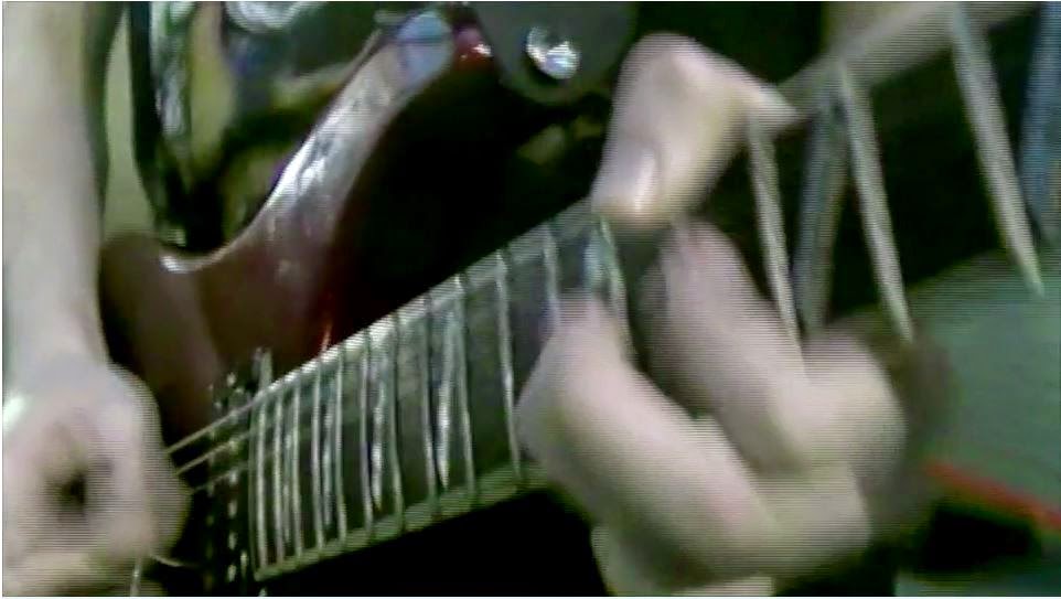 |
| Although hard to see in the picture, this is the footage in HD with the lines. |
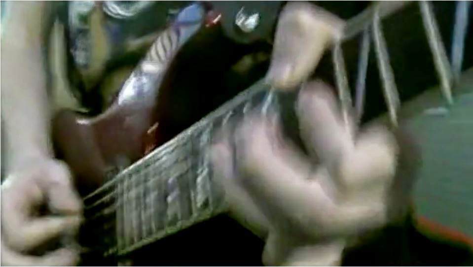 |
| This is the footage not in HD so much smoother overall. |
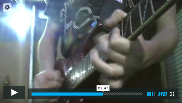 |
| Vimeo |
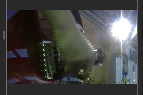 |
| Final Cut Pro |
The difference in quality is easier to see here, you can see just how lined the footage is in the picture directly from Final Cut Pro. Overall there is a slight improvement on quality from HD upload from Final Cut to Vimeo either way, but its only when the footage is played in Vimeo, not in HD that the footage is in the best quality.
I considered the cause of this and decided what probably happened, was the camera with this issue might have been filmed not in HD so when trying to play it in HD it isn't compatible with a HD stream, so when played not in HD do you see the accurate representation of the camera quality.
Thursday, 12 February 2015
Band Photoshoot

Today I am photoshooting the band for images for their website and Digipak.
I am performing the shoot in a local woods, taking conventions from existing rock band album covers such as Black Stone Cherry; Folklore And Superstition.
This band do however take themselves quite serious, which Black Syndicate do not. So the overall feel of the Photoshoot/digipack cover will not be as serious.
Although they are a pop band, Me First And The Gimmie Gimmies are a parody/cover band from America. Their whole characteristics and personality is similar of that of Black Syndicate;


The overall style of my work will be a combination of the styles of the two bands; Black Stone Cherry and Me First And The Gimmie Gimmies
When looking up digipak case I discovered a number of templates that you can download and use for your own personal use. The standard Digipak case has two sleeves to it, one to store the booklet, the other sleeve for the CD itself. However when researching templates I was unable to find a template with two sleeves, so will adapt a template with a single sleeve to be correct for two sleeves.
http://www.oasiscd.com/graphics/templates-digipak.asp
Thursday, 5 February 2015
Feedback on Final Version
To help get feedback on my final Media Studies Music video, I posted it on my facebook, to hopefully get back some feedback on it.


However this feedback session was a little unsuccessful and only received one answer, although, this feedback was very positive, as shown below.
Website conventions
I found a Prezi made by another media studies student, about the conventions of a website. Its the conventions shown in this presentation that I must conform to in my final website. Some of which I have already met with my website.
I have recently developed the website further towards the final site. I have inserted all the key points on the website in place, with some basic detail and finish.

I have filled all the links in the 'connect with us' section with their pages, added their music from soundcloud on the right.
I have recently asked the band for information on new tours and news, but they only have one tour coming up which I added to the Dates section, I made up some news to add to the Lastest News section for now. I wanted to create some form of enigma for the audience to keep checking on the band, so added the mystery event on the 10th April.Colour Correction
 |
| Using colour balance setting I changed the exposure, brightness, contrast and colour tones to the footage. I saved this 'present' so I could later apply it to all of the clips. |
 |
| The original footage was quite lit and bright, which isn't conventional of music video for a heavy metal band. |
 |
| I had to basically match the colour of the footage to the colour of the worst quality camera. The worst camera had a kind of green tone to the footage, I did actually quite like this look as it further added to the dystopian effect I was looking for. This was want my final set 'present' looks like on one clip. |
 |
| Although I added the same 'Present' to all the clips, due to changes in light and camera quality and other factors I couldn't control it didn't always look the same across all footage. |
 |
| So using the colour balance tool again I made slight changes to the 'present'. You can see on this footage of the drummer, is very, very green once the present was added to it. |
 |
| So to counteract the green tones on the original footage, I added some pink tones as they are opposites on the colour wheel, so counter balance the green tones. |

The footage inside the studio gets steadily darker as well, as I wanted to impose the idea of the zombies bringing in the darkness so for that idea to be consistent, the zombies need to have the darkness outside which they bring in with them as they enter the studio.
Friday, 30 January 2015
First rough cut
morrighan media first final rough cut from morrighan humpleby on Vimeo.
I have recently finished my first rough cut of the music video to show to my media studies class, my band but also the focus group I have put together.
I will add the feedback I received in a following post.
There are issues I am aware off, one of them being that the colour of the footage changes from camera to camera. I don't mind that the quality is different, as I previously stated I feel like it makes it look more grungy. Its just that some of the clips have a different colour to them and have a green tint to them, which I need to either change or make all the other clips like that too. In addition I am aware that I want the whole thing to be a little darker as it would create more of a dystopian feel to the music video, which is the scene I wanted to set for a zombie apocalypse.
I will create a questionaire for my audience who I wont meet face to face to answer. Whereas for my media studies class I will ask them the questions and film their responses.
Here is the link to survery I created that I will give to the band and the focus group, with the questions I will ask my media studies group.
feedback from morrighan humpleby on Vimeo.
https://www.surveymonkey.com/s/7HK578P
Below is a Emaze presentation I created analysing the answers that I got from my audiences.

I have recently finished my first rough cut of the music video to show to my media studies class, my band but also the focus group I have put together.
I will add the feedback I received in a following post.
There are issues I am aware off, one of them being that the colour of the footage changes from camera to camera. I don't mind that the quality is different, as I previously stated I feel like it makes it look more grungy. Its just that some of the clips have a different colour to them and have a green tint to them, which I need to either change or make all the other clips like that too. In addition I am aware that I want the whole thing to be a little darker as it would create more of a dystopian feel to the music video, which is the scene I wanted to set for a zombie apocalypse.
I will create a questionaire for my audience who I wont meet face to face to answer. Whereas for my media studies class I will ask them the questions and film their responses.
Here is the link to survery I created that I will give to the band and the focus group, with the questions I will ask my media studies group.
feedback from morrighan humpleby on Vimeo.
https://www.surveymonkey.com/s/7HK578P
Below is a Emaze presentation I created analysing the answers that I got from my audiences.
Thursday, 22 January 2015
Ancillary Products; Website
 |
| I have started adding the social network accounts for the band to the website |
 |
| Although this isn't the image I will be using as the header for my website, I have put it in the correct place on the site to create a visual representation of the website, but I will later change. |
Friday, 16 January 2015
Style of work
In terms of the style behind the Digipak and Website they said they wanted a particular style, a style like the band Black Stone Cherry; http://www.blackstonecherry.com/

 The style of their website is very dark but simple and easy to navigate and follow around the site. I will keep the navigation and appearance of the site very simple too. However they did express that they wanted it to be a little more interactive, so will have links to videos rather than just a play button for the songs. On the home page there will be the more recently videos/songs, latest news and contact details.

The CD will be inspired by that of Black Stone Cherry's Folklore And Superstition album, based in a wood, with no form of special effects or anything. The font will be basic and not 'perfect' looking. I am looking at getting the member of the band to write it in their own hand writing to make it more personal to the band. The back would have the track list written on it, so would get the band members to write that too.

 I will keep the template of the digipak simple and traditional. If you look at exciting digipaks from heavy metal/rock bands, their CD cases aren't overly complicated, but stay traditional.
The CD will be inspired by that of Black Stone Cherry's Folklore And Superstition album, based in a wood, with no form of special effects or anything. The font will be basic and not 'perfect' looking. I am looking at getting the member of the band to write it in their own hand writing to make it more personal to the band. The back would have the track list written on it, so would get the band members to write that too.
Friday, 9 January 2015
Focus Group
I have recently spoke to my band to see if they have close contact with a few of their fans that they feel would be good for a focus group. They have explained they know a few people that they feel would be happy to submit feedback on the music video and its ancillary products. The band will give me contact details for these people.
Sunday, 21 December 2014
Make up for my production
 A good friend of mine, Ellen Archer studies Media Hair and Make Up at city college. I will be using her to do the make up for my production. I have given her rough sketches of how I want the make up to look. On set she informed me that she was also interested in creating the costumes for the zombies too, so she could add the whole group of zombies make up, hair and costume to her portfolio. Ellen ripped the zombies costumes where she felt appropriate and I told them I wanted them to be scruffy and muddy etc. They then went outside and they rolled in the dirty to get the messy look I wanted. Following the drawings I made for my make up artist, she created wax wounds on their faces/bodies, added fake blood to the wounds and their clothes. I wanted the zombies to have pale faces, pinky eyes and back combed hair.
 |
| This was the final outcome of my zombies hair, make up and costume. Below are close ups of the wounds on the zombies faces. |


I was very, very pleased with the outcome of the zombies make up. as it was very convincing and effective. I particularly like the fake wounds on the models faces and bodies.
Although the band didn't require any make up for their scenes as a normal human band, they needed to have make up for the zombie scenes. Ellen(my make up artist) followed the same idea of make up and hair for the band when they are zombies. As shown below(I apologise for the faces in the pictures, the band are never serious)


 |
| Here is the group shot of all the band members in their costumes. I didn't want to change their costumes and make them dirty etc for continuity reasons. The original zombies came from outside so them being dirty makes sense, however the band members never left the building they were playing in, so would have no way of getting dirty. |
Subscribe to:
Posts (Atom)